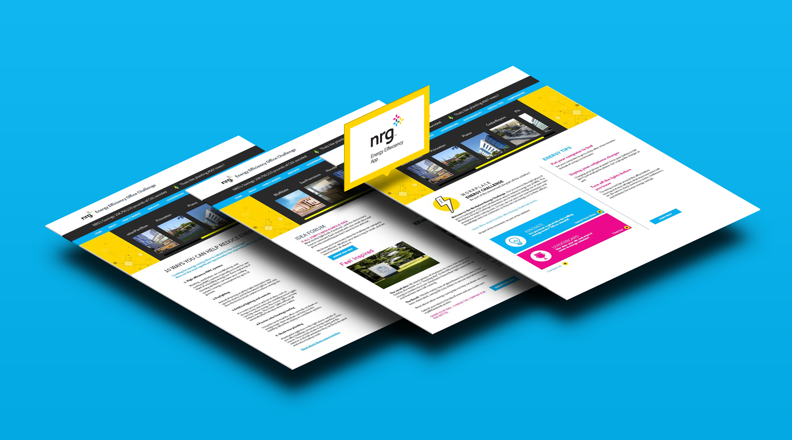
NRG Savings App
NRG Office Interface: Simplifying Complex Energy Data
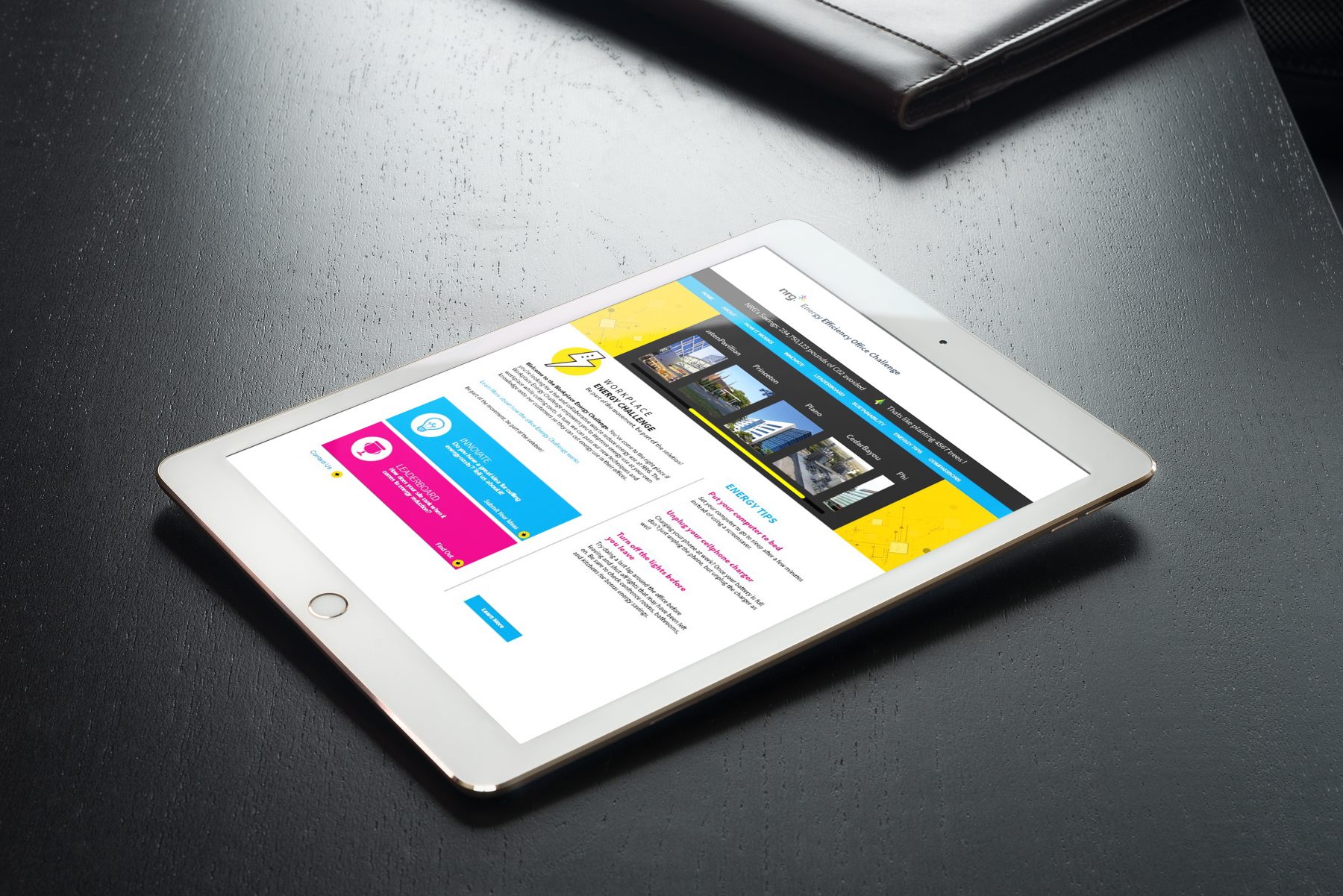
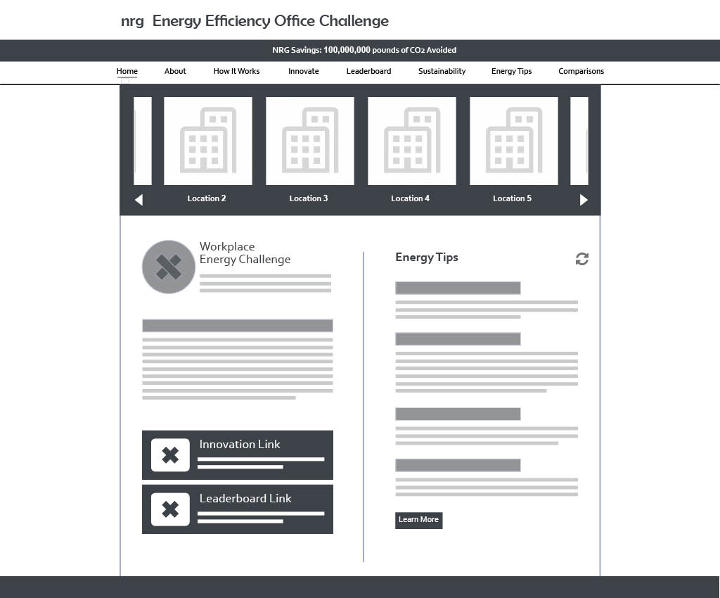
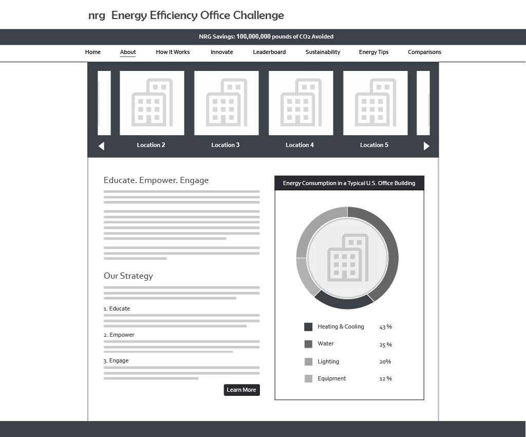
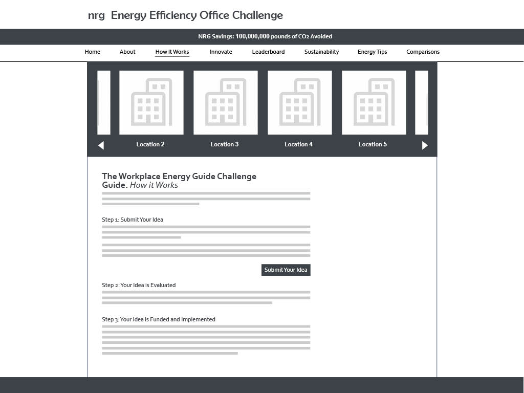
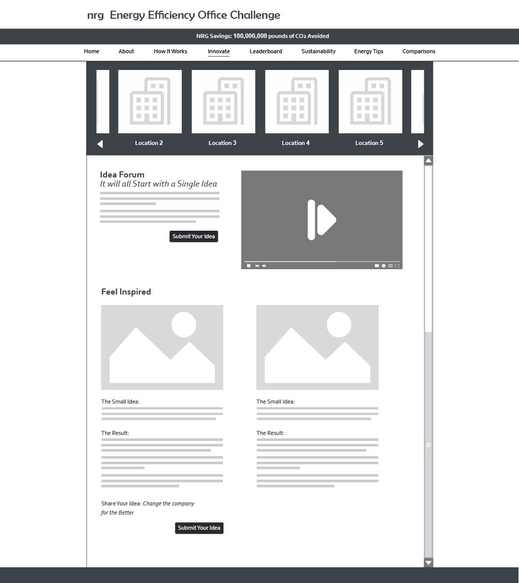
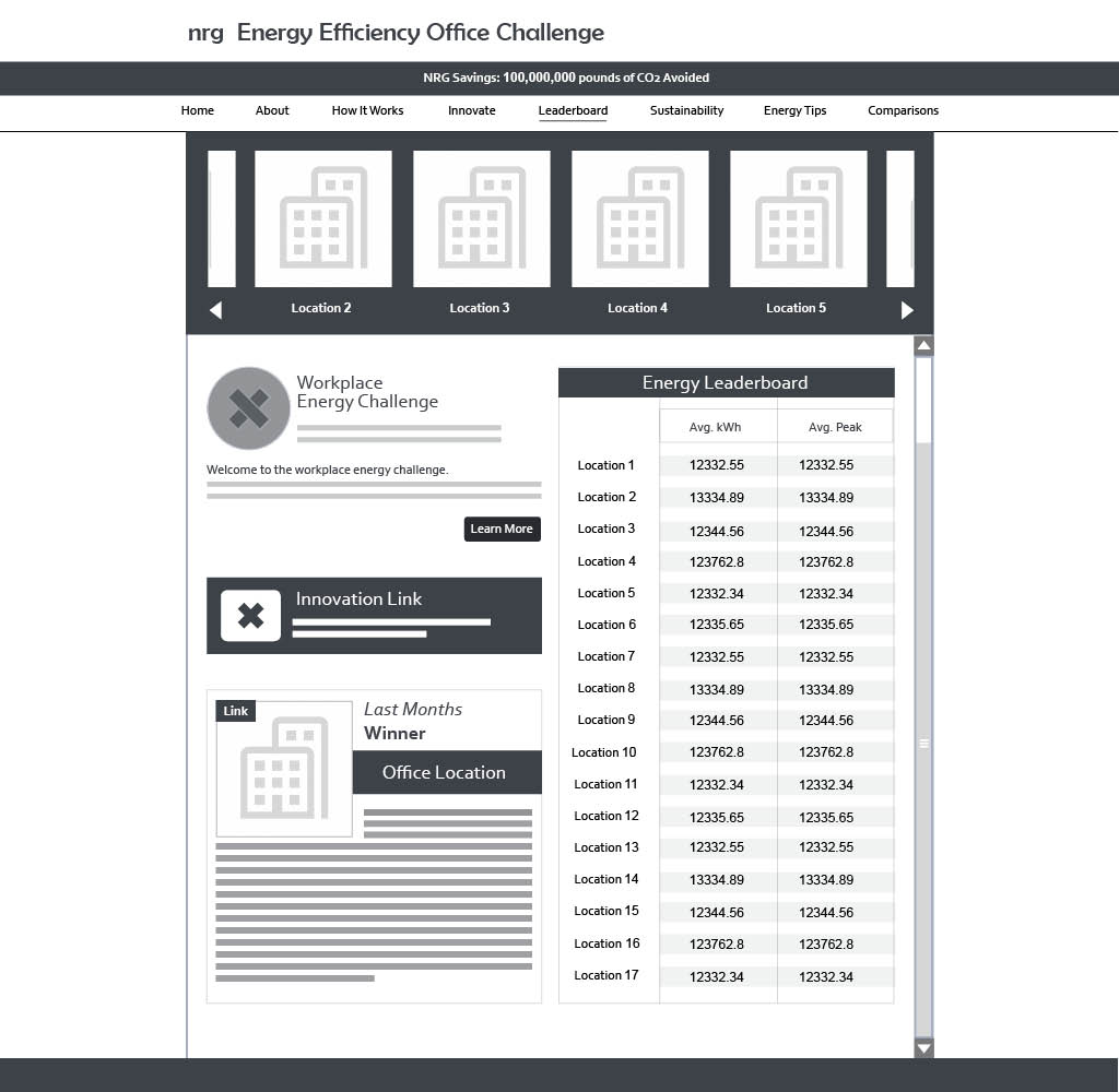
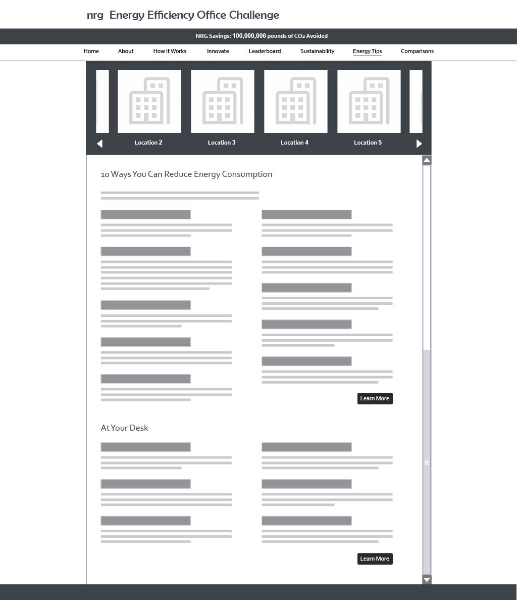
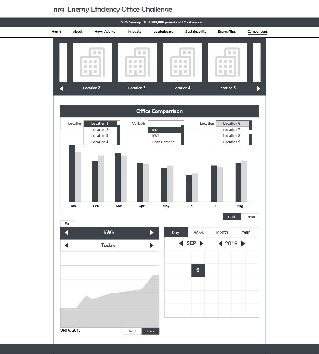
For NRG, a leader in the energy sector, the goal was to design an office interface that allowed users to monitor and control energy systems efficiently. This project focused on creating a user-centric platform that simplified the presentation of complex energy data while ensuring that the interface aligned with NRG’s forward-thinking brand.
Design Challenges and Goals
The primary challenge was to translate vast amounts of energy data into a clean, intuitive interface. The system needed to empower users to make informed decisions in real time, balancing technical complexity with ease of use. To achieve this, the design goals included:
- Clarity and Accessibility: Presenting data in a way that is easy to interpret, even for non-technical users.
- Efficiency: Streamlining workflows to help users navigate the interface quickly and complete tasks with minimal friction.
- Brand Consistency: Ensuring the interface reflected NRG’s innovative and professional identity.
Design Approach
The process began with in-depth research to understand user needs and workflows. By mapping out user personas and their pain points, I was able to design an interface that catered to their specific needs. Key aspects of the design process included:
- Visual Hierarchy: Critical information was prioritized using a clean layout and intuitive navigation, ensuring users could quickly identify key metrics.
- Color-Coding: A carefully selected palette was implemented to differentiate energy systems and states, helping users visually parse data at a glance.
- Responsive Design: The interface was optimized for multiple screen sizes, allowing users to seamlessly access the platform across devices.
- Interactive Controls: Real-time toggles and dynamic graphs enabled users to monitor, adjust, and control energy systems with precision.
Impact
By simplifying complex data, it allowed users to make better decisions faster, improving overall energy efficiency. Feedback from stakeholders highlighted the interface’s usability and visual clarity, which made it a powerful tool for the company.
- Category UI/UX Design
- Category UI/UX Design