
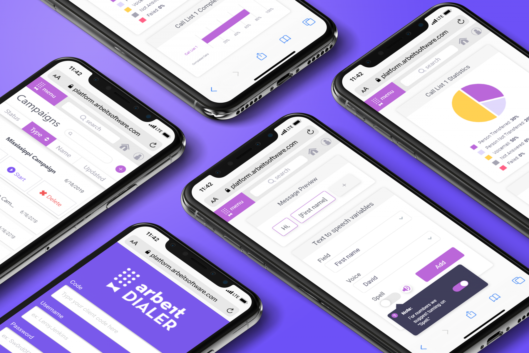
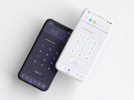
Mobile Dialer
Mobile Dialer Redesign: Making a Web-Based Tool Mobile-Friendly
The mobile dialer project aimed to transform a pre-existing web-based dialer I had designed into a mobile-friendly experience. The goal was to ensure that users could seamlessly interact with the tool on their phones without encountering broken or unusable layouts.
Design Goals
The key objectives were usability, scalability, and accessibility. I wanted the mobile dialer to not only function well across devices but also feel intuitive and modern, addressing the unique needs of the users. Inspired by principles of simplicity and clarity, I focused on creating a design system that was consistent, efficient, and user-friendly.
My Role
I was the sole designer on this project and took ownership of every stage, including research, ideation, wireframing, prototyping, and testing. I collaborated with our sales associates to test the layouts and user flows, gathering valuable feedback directly from those who would rely on the dialer daily. Additionally, I was involved in the programming, implementing the design in Angular, which was a new and exciting challenge for me.
Design Process
I followed a thorough and iterative design process:
- Research: Given the lack of modern references in the dialer industry, I researched user workflows and challenges, focusing on the specific needs of debt collection professionals.
- Ideation and Wireframing: I used wireframes to map out potential solutions for mobile-friendly layouts, ensuring they would translate well to smaller screens.
- Prototyping and Testing: Prototypes were created and tested with our sales associates to validate the design and refine the user experience.
A significant challenge was the industry’s outdated design standards, which meant I had no external references to guide the process. This required a highly creative and problem-solving approach to define a new standard for the mobile experience. To speed up the design and iteration process, I leveraged an atomic design approach, creating modular components that could be reused and quickly updated across the project.
Key Features
The design emphasized flexibility, allowing users to minimize the screen and work across multiple windows or programs. This was a pain point with other software, which often forced users to toggle between tools inefficiently.
Impact
The feedback from users and stakeholders was overwhelmingly positive. Sales associates reported that the new mobile design sped up their workflows by allowing them to manage tasks more efficiently, even on smaller screens. Additionally, the project introduced a modular design system that influenced other parts of the product, setting a new benchmark for UI/UX across the company.
Reflection
This project taught me the value of designing for flexibility and scalability. If I were to do it again, I would take a mobile-first approach, starting with small screen designs and scaling up to full-screen layouts. This would ensure the mobile experience was not an afterthought but rather a primary consideration, with the added benefit of simplifying the process of adapting to larger screens.
This project showcased my ability to identify user needs, innovate within a constrained industry, and deliver a solution that enhanced both productivity and user satisfaction. It also demonstrated my capability to balance design and development, which allowed for a seamless handoff and implementation.
- Category UI/UX Design, User Interface
- Category UI/UX Design, User Interface