Empire State Woodworking
Empire State Woodworking: A Logo Inspired by Craft, Nature, and Serendipity
Project Overview
Empire State Woodworking, a Buffalo-based furniture maker, approached me to create a logo that reflected their artisanal craftsmanship and deep ties to the natural world of Western New York. The goal was to design a logo that would feel timeless and rooted in tradition while standing out in a modern marketplace.
As I brainstormed and sketched ideas, a serendipitous moment occurred—two Downy Woodpeckers, native to the region, landed on a tree outside my office window. Inspired by their presence and the connection between woodpeckers and trees, the concept for the logo crystallized. This design would not only symbolize the company’s craft but also pay homage to the natural world that informs their work.
Design Concept
The logo draws inspiration from Japanese woodblock prints, known for their intricate line work and harmony between detail and simplicity. Starting with a hand-drawn sketch, I translated the concept into a detailed yet minimalist composition, reflecting the care and precision of traditional craftsmanship. The design process included:
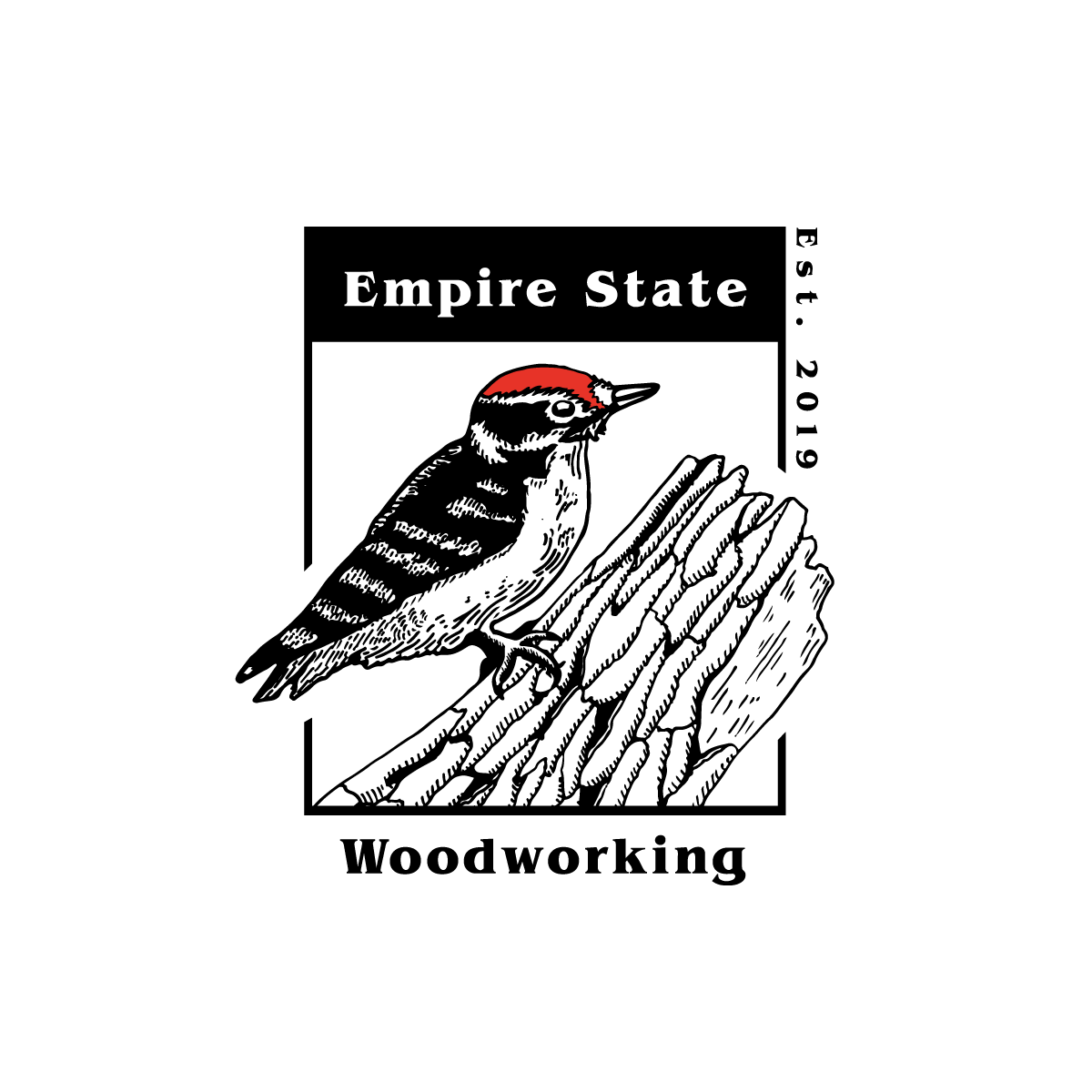
- Illustration: The Downy Woodpecker, perched on textured bark, was carefully sketched by hand, capturing the intricate details of its feathers and the rugged bark.
- Digitization: After completing the initial sketch, I brought it into the digital realm, refining it into a clean, high-contrast, two-tone design that balances artistry with modern versatility.
- Composition: The woodpecker is framed within a bold rectangular border, creating a structured and balanced visual that is both timeless and adaptable.
Key visual elements include:
- Red Crest Detail: The vibrant pop of red on the woodpecker’s head adds energy and focus, drawing the viewer’s eye while maintaining a natural aesthetic.
- Japanese Aesthetic Influence: The textured line work and minimal color palette echo the sophistication of traditional woodblock prints, reinforcing the logo’s connection to craftsmanship.
- Typography: The classic serif typeface lends a sense of tradition and professionalism, while the vertical “Est. 2019” detail introduces a contemporary touch.
Outcome
The final logo successfully embodies Empire State Woodworking’s dedication to craftsmanship, local pride, and natural inspiration. The Downy Woodpecker serves as a perfect metaphor for their work—precise, enduring, and deeply connected to the materials they shape. The logo’s aesthetic seamlessly blends tradition with modernity, making it versatile across branding applications, from signage to furniture tags.
Reflection
This project was a personal and creative triumph, blending a moment of serendipity with thoughtful design. Drawing inspiration from Japanese woodblock prints and the natural world allowed me to create a logo that is both visually striking and deeply meaningful. This process reinforced the value of trusting intuition and moments of inspiration to guide creative work.
If I were to revisit this project, I would explore additional applications of the Japanese-inspired design language across other branding elements to further unify the brand’s identity. The experience underscores how meaningful connections to nature and craft can elevate a brand to resonate authentically with its audience.
- Category Branding
- Category Branding


