Tipify IoT Platform
Tipfy: Naming, Branding, and Visual Identity for Intellastar’s IoT Platform
Project Overview
The Tipfy project focused on creating a unique identity for Intellastar’s IoT platform. The challenge was to develop a distinct name and cohesive visual branding that aligned with Intellastar’s existing image while appealing to a forward-thinking audience in the IoT industry. My task was to create a name, logo, color scheme, iconography, and marketing materials that positioned Tipfy as an approachable yet innovative solution for monitoring and controlling IoT devices.
Challenges
Naming Challenges:
- The name needed to be short, memorable, and easy to pronounce, with a domain name available.
- It had to align with IoT functionality, evoking accessibility and efficiency.
- It needed to stand out while reflecting Tipfy’s innovative nature.
Logo Design Challenges:
- The logo needed to harmonize with Intellastar’s branding while standing on its own.
- A minimalist, typography-driven approach was required for versatility.
- The design had to feel professional yet dynamic, suitable for both digital and print mediums.
My Role
I led the naming, branding, and visual identity creation for Tipfy. From brainstorming and research to finalizing the logo and visual assets, I was responsible for every stage of the process. The stakeholders, including the CEO, were immediately supportive of my vision, and the designs were an instant hit with no major revisions.
Design Process
- Naming:
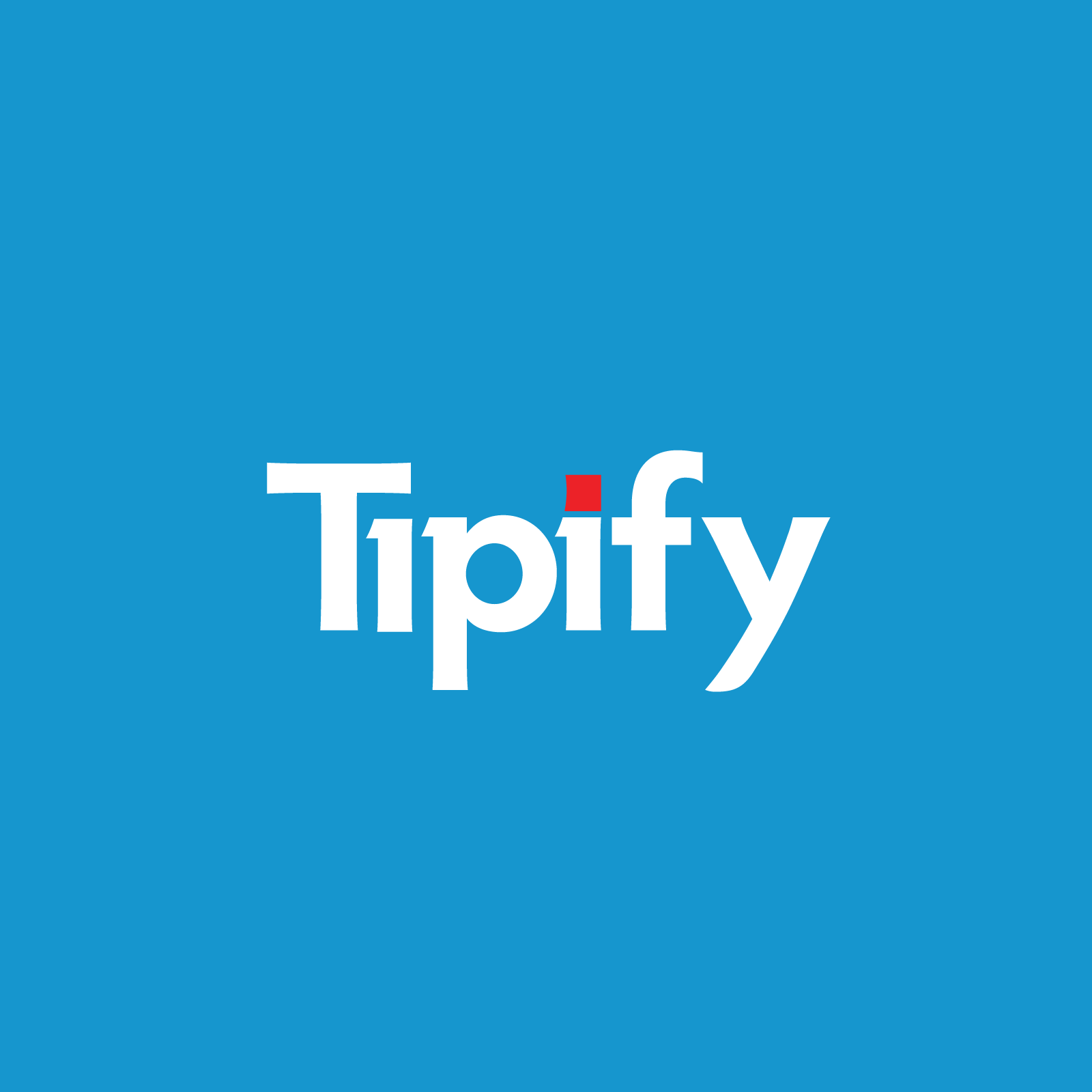
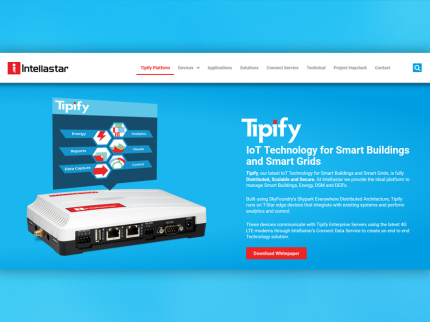
After exploring numerous options, I proposed Tipfy—a name that is short, intuitive, and approachable, while suggesting precision and efficiency. The name captured the platform’s purpose and resonated with stakeholders on the first pitch. - Logo Design:
- The clean, sans-serif typography conveys simplicity and professionalism.
- The red accent on the “i” symbolizes action, energy, and innovation, contrasting against a primary blue background that communicates trust and reliability.
- The minimalist design ensured versatility across both web and print applications.
- Brand Aesthetic:
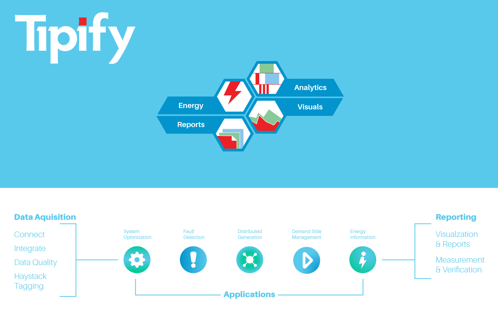
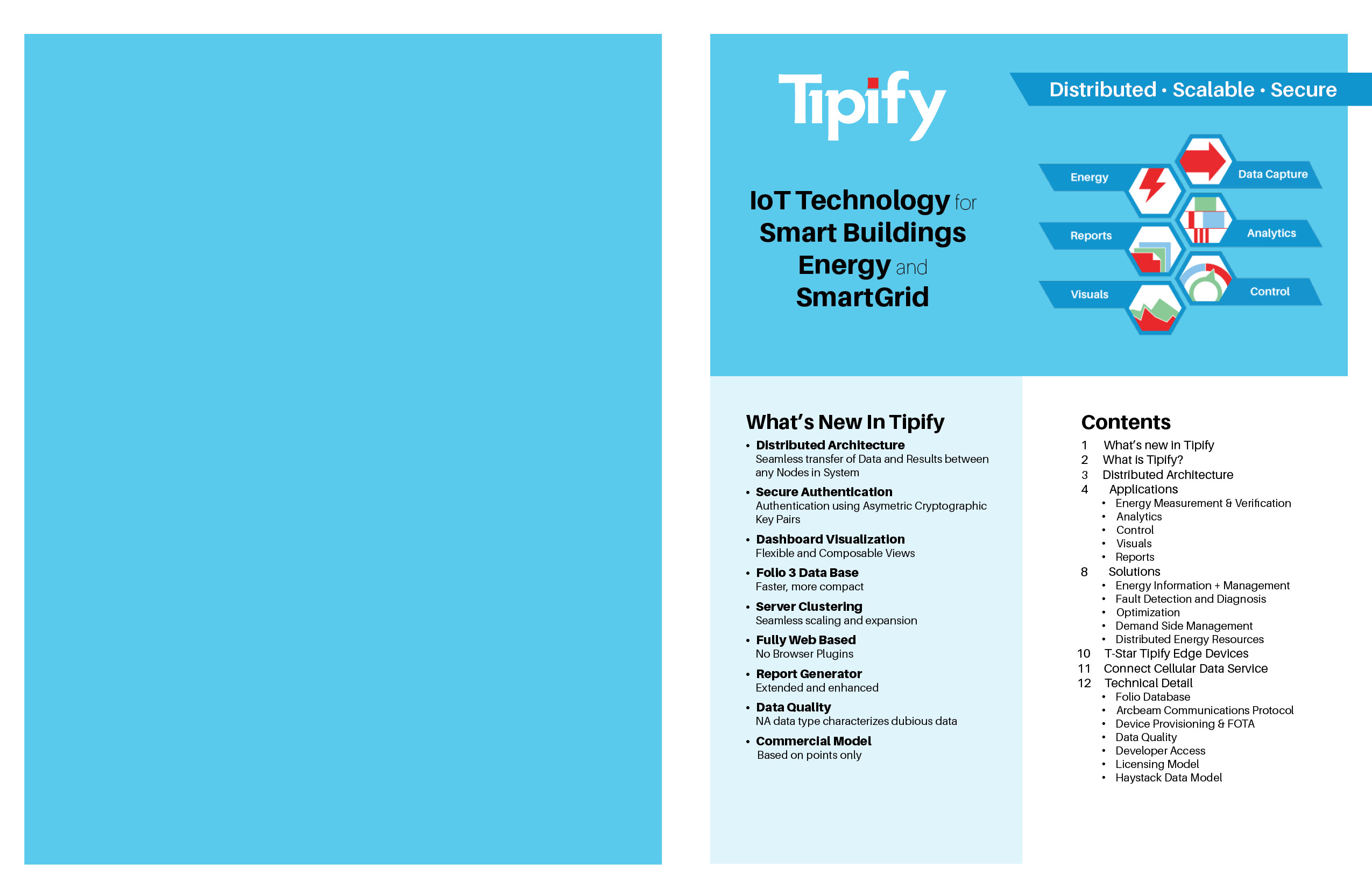
- I designed a color scheme of blues and vibrant red accents to establish trust, innovation, and energy.
- Custom icons and marketing materials were created to ensure consistency across digital platforms and print collateral.
- Implementation:
- The branding system was developed with scalability in mind, ensuring it could adapt seamlessly to future marketing materials and product expansions.
Impact
The branding and visual identity for Tipfy received immediate approval from stakeholders and positioned the platform as a fresh, forward-thinking player in the IoT industry. The cohesive design system and memorable name created a strong foundation for marketing and product adoption.
The minimalist, typography-focused logo and energetic visual elements set the tone for the platform’s approachable yet professional image, resonating with both internal stakeholders and external clients.
Reflection
This project stands out as an example of how well-thought-out design can align with business objectives to create an impactful brand. Unlike some of my earlier projects, this one benefited from stakeholder alignment and trust, allowing me to execute my creative vision with minimal pushback.
If I were to approach this project again, I would:
- Leverage user testing and feedback to ensure the branding resonates not only with stakeholders but also with the broader target audience.
- Work with marketers earlier to create a detailed strategy for launching the brand to maximize impact.
Tipfy showcases my ability to create strategic, user-centered brand identities that balance creativity with practical business needs. This project highlights my skills in naming, visual design, and delivering results that exceed stakeholder expectations.