


Philly Farms
Philly Farms: A Bold Yet Elegant Identity Rooted in Nostalgia
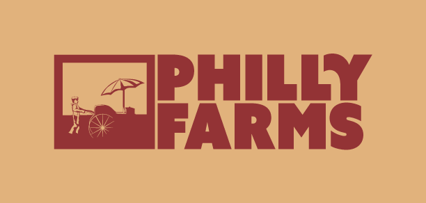
For Philly Farms, a Philadelphia-based produce store and truck, the challenge was to create a logo that captured the client’s vision of a bold yet elegant aesthetic inspired by the 1920s–40s. The client envisioned a man pushing a vintage food cart, a symbol of the neighborhood’s rich history and the tradition of street vendors bringing fresh produce to the community.
Design Concept
The final logo strikes a balance between historical authenticity and modern appeal. I began with a hand-drawn pen-and-ink illustration, which was then refined into a clean, two-color vector illustration. This approach added a contemporary twist to the nostalgic imagery while ensuring the design was versatile across digital and print applications.
By leveraging negative space, the cart emerges as a focal point within a dynamic frame, creating a sense of depth and storytelling. The light detail on the wheel adds a touch of elegance, enhancing the visual sophistication of the composition.
Typography and Color Palette
The logotype was carefully selected to complement the bold illustration without overshadowing it. A heavy, geometric sans-serif typeface anchors the design, while subtle flourishes—such as the curved “Y”—soften the overall tone, making the logo feel approachable and inviting.
The earthy, natural color palette reinforces the brand’s connection to fresh produce and sustainability, while avoiding overly bright tones that could detract from the logo’s timeless elegance.
Outcome
The Philly Farms logo delivers a bold visual identity that is equally rooted in nostalgia and modernity. Its strong iconography and thoughtful typography establish the brand as approachable, trustworthy, and deeply connected to the local culture it serves. The result is a logo that stands out in the competitive food and produce industry while staying true to the client’s original vision.
- Category Branding
- Category Branding