


When I joined Intellastar, I noticed opportunities to improve the company’s branding to better align with its values and energy. After sharing my thoughts with colleagues, I discovered others shared my sentiment, which motivated me to explore solutions in my own time. Over several months, I developed a fresh branding concept, complete with a style guide, but I waited to present it until I had built trust and credibility within the organization.
A year later, I pitched the concept to leadership, even though it was a bold move, given my manager’s personal connection to the existing branding. The presentation exceeded expectations, and I was entrusted with leading the rebranding effort.
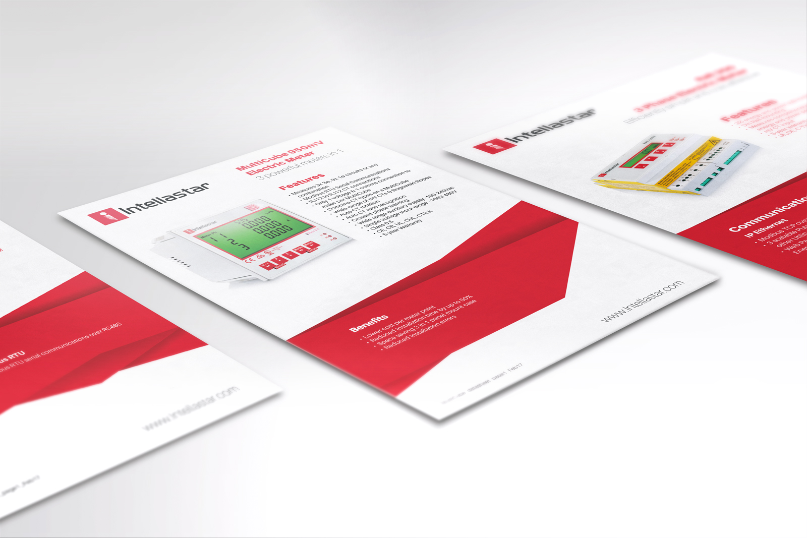
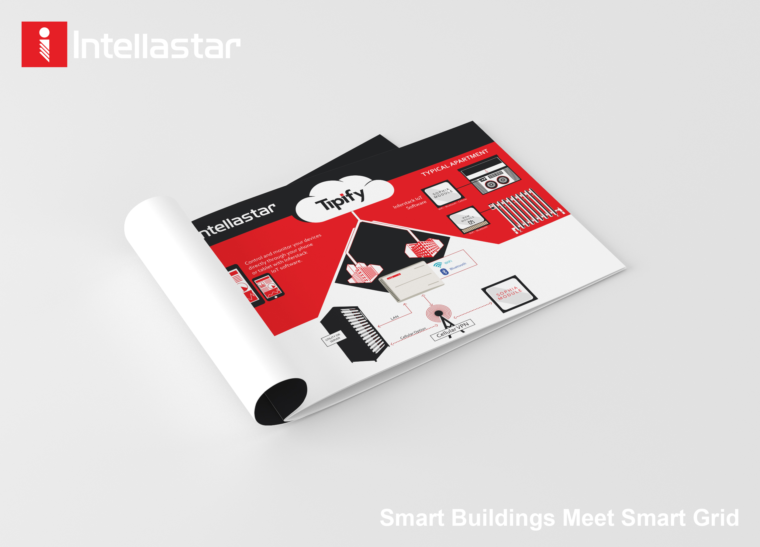
Design Approach
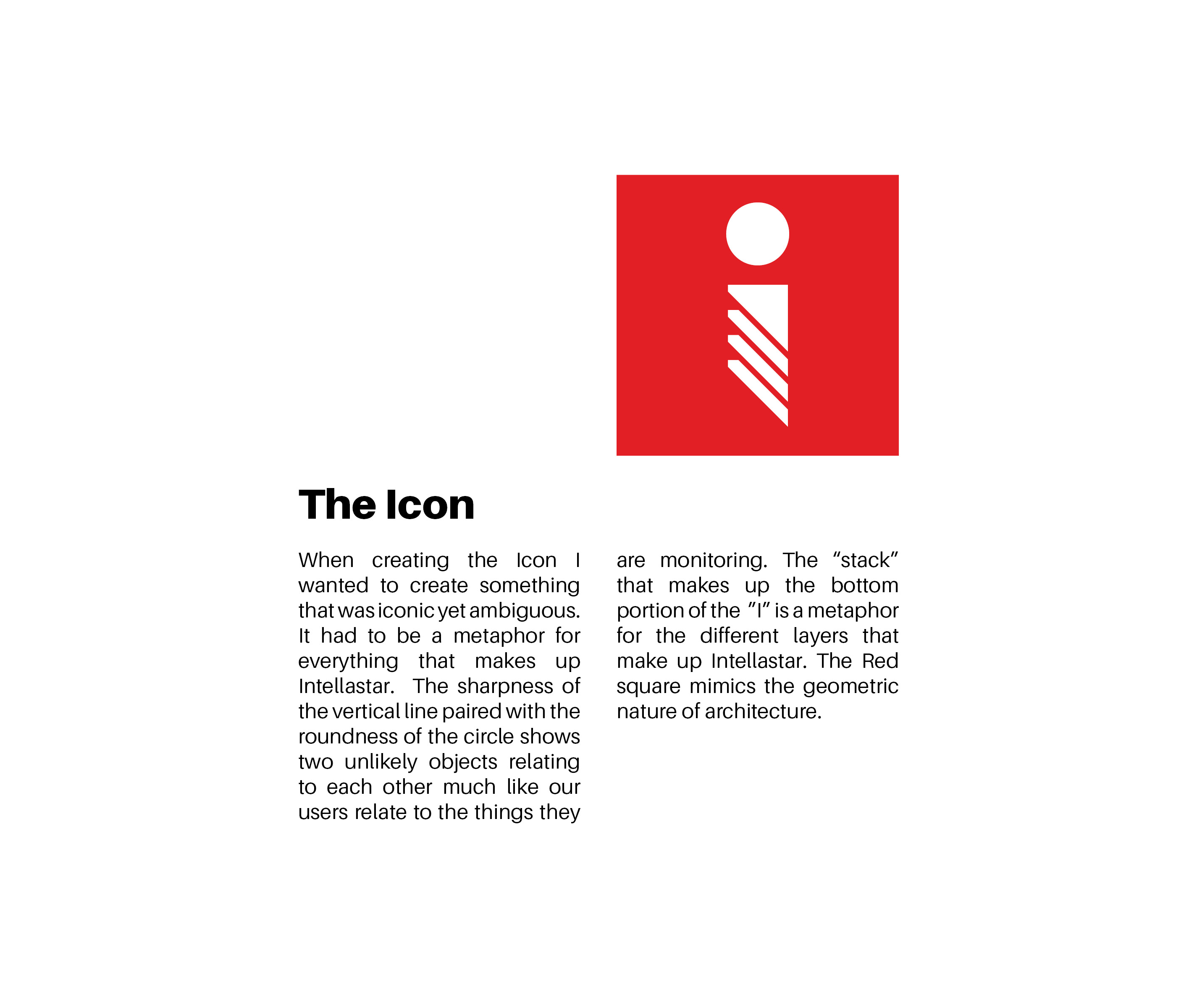
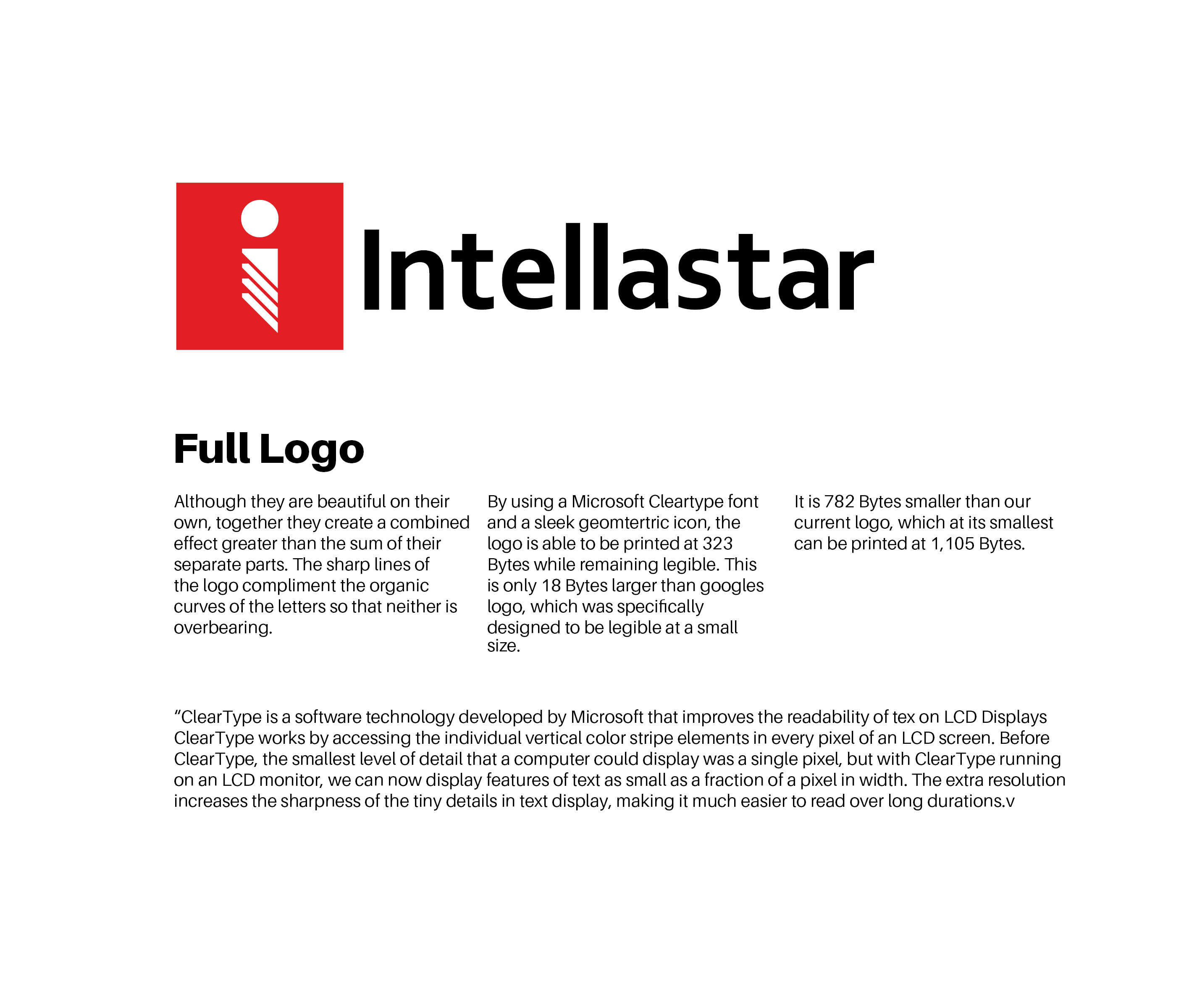
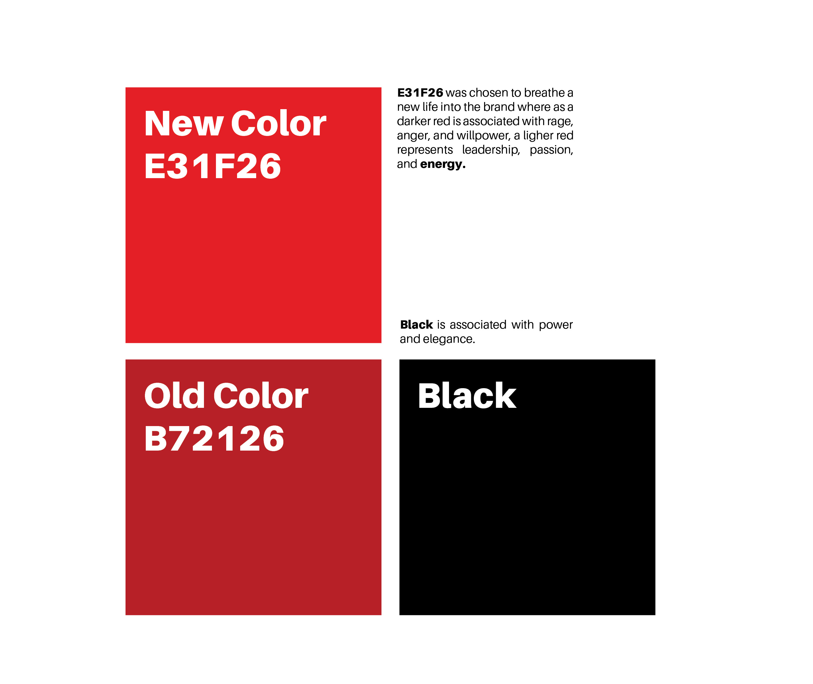
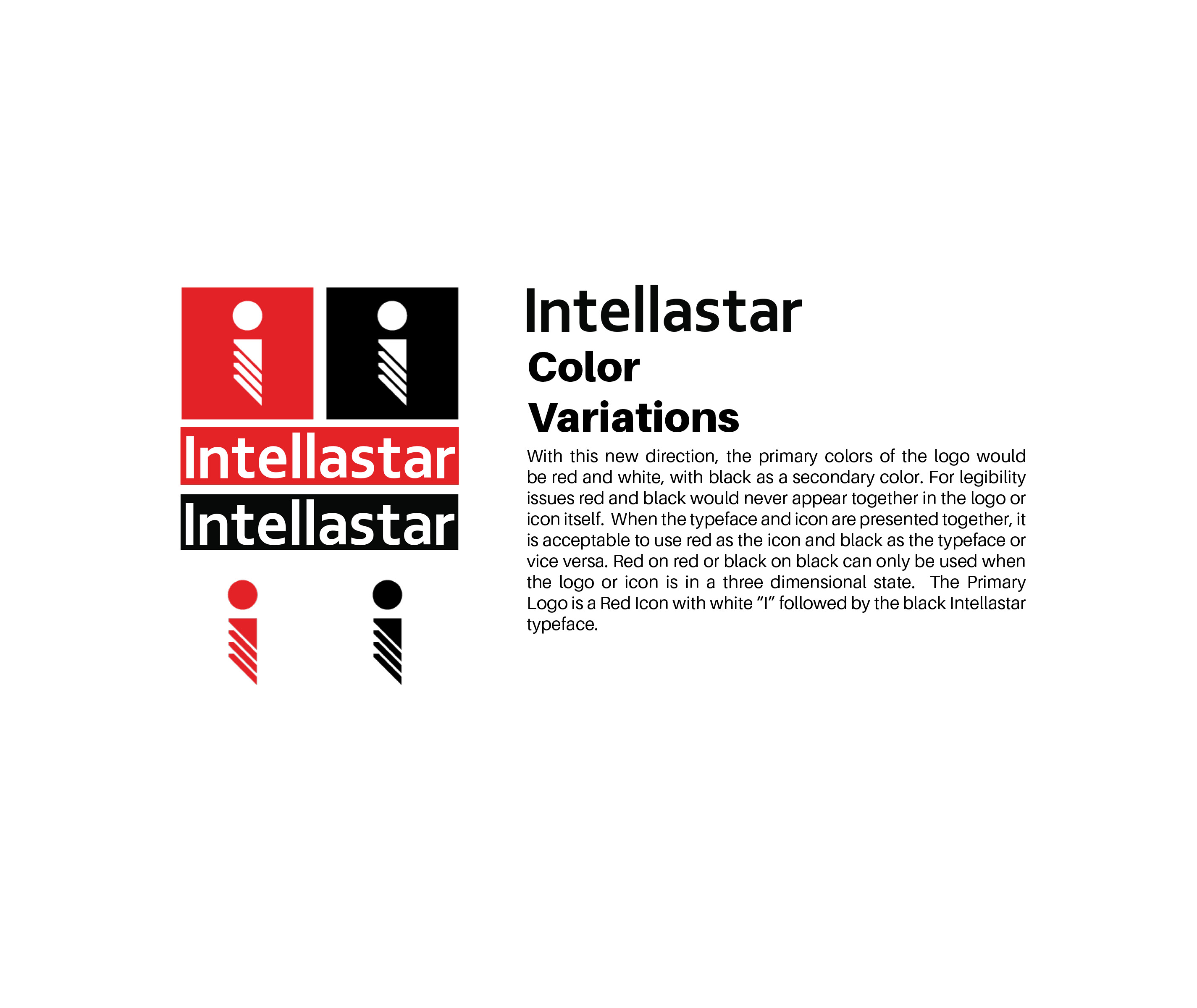
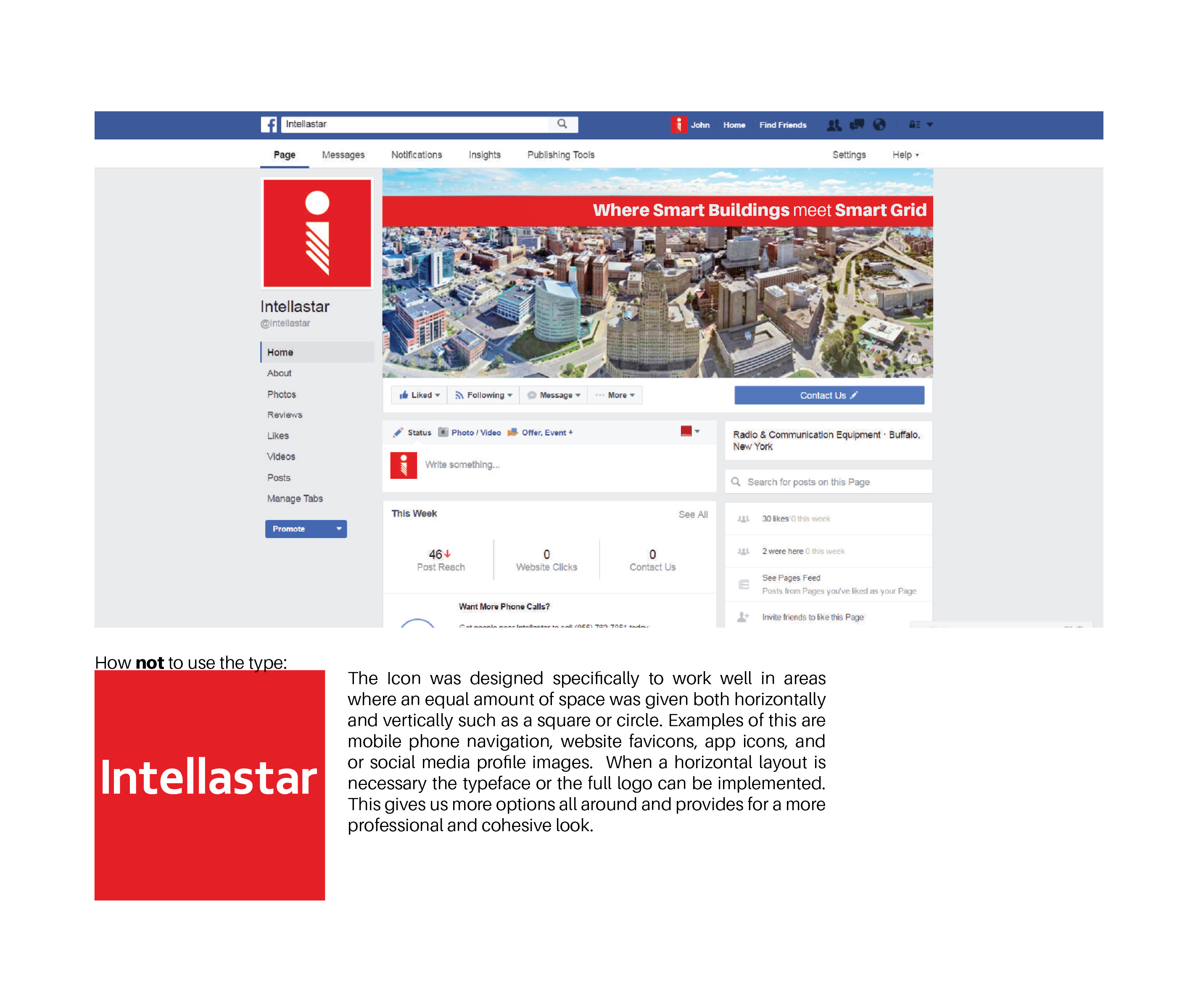
- Intellastar Icon: I designed the logo to be a metaphor for the brand’s essence: the intersection of structure and flexibility. The vertical line and circular form reflect contrast and harmony, while the “stack” at the base symbolizes the layered complexity of Intellastar’s offerings. The vibrant red square injects energy and leadership into the design, differentiating it from darker reds traditionally associated with anger or aggression.
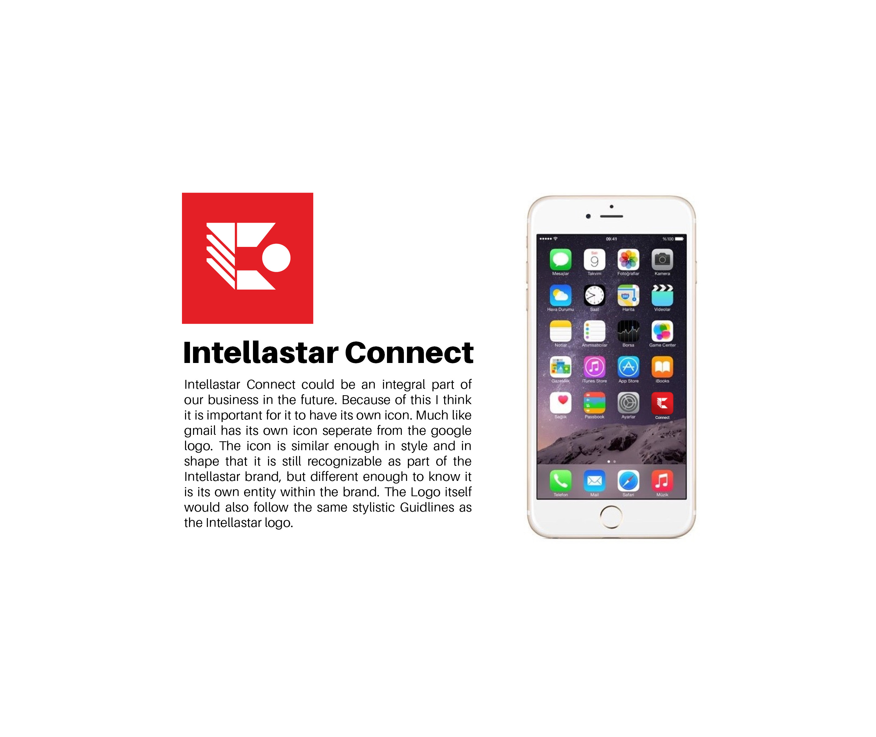
- Connect Icon: Recognizing the importance of Intellastar Connect, I created a complementary yet distinct icon that adheres to the overall brand guidelines. Its similarity to the main logo ensures cohesion, while its unique form establishes its identity within the ecosystem.
This project highlights my ability to identify opportunities, take initiative, and deliver thoughtful, system-based design solutions that resonate with both internal stakeholders and external audiences.